The Shared Services Center (SSC), is a one stop shop that is involved in the finances and business aspects for the University of Maryland, Baltimore County.
The Shared Services Center website suffered from decreased audience because of usability issues like difficulties in content discovery, search relavance, and structure related issues.
My Role
User researcher and web developer working in a team comprising of Business and Finance Specialists. I was responsible for carrying out the user research and implementing the findings from the data through front-end web technologies to make the website more usable.
Outcome
Through user research and web design afterward, we changed the website's existing structure to increase the number of people visiting the website.
Goals
Improve parameters like the amount of time spent by the user on the website, Increase the number of users, and reduction in bounce rates. In addition, another goal of ours is to provide good content even if the website was relatively smaller as compared to other websites of the university.
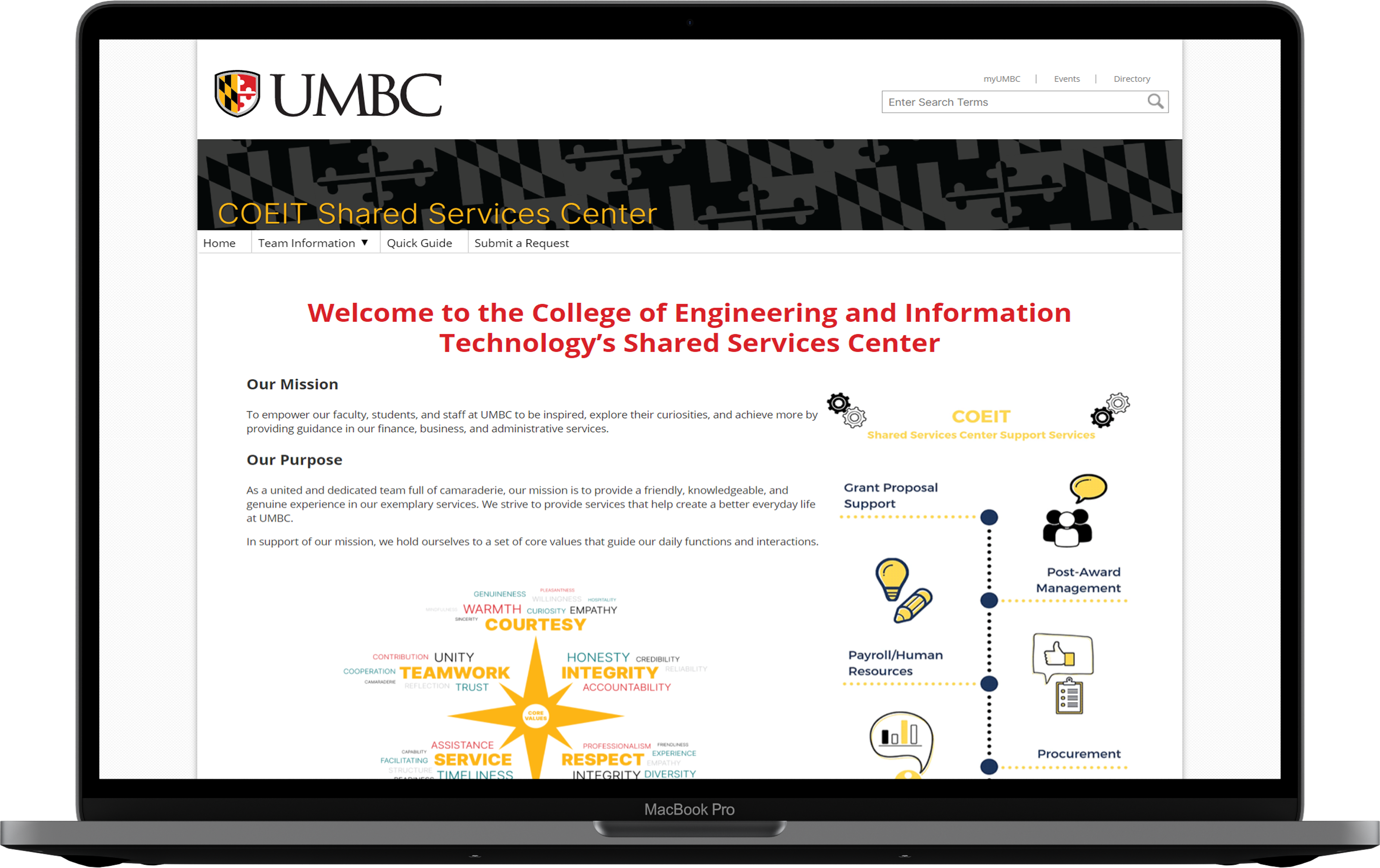
Landing Page of the Redesigned Website
Challenges
Difficult to settle on a single design for the rework.
Condensing an already small architecture to accomodate the users needs.
Improving content discovery on technical information was time consuming because of the learning associated with it.
It was the first time I was handling quantitative data, so it took a while for me to learn and apply the concepts.
Using Wordpress for content management was extremely challenging because it removes any flexibility required by the developer for content that would make the website aesthetically pleasing, or improve the functioning dramatically.
I have been to this website before, so I know what is happening. If I was new, I would just be staring at it.
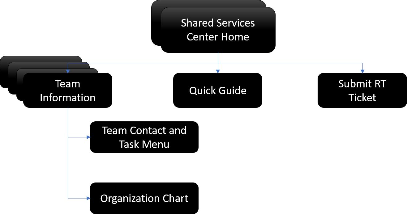
Older Information Architecture
UX Research - How do we improve the website?
We were on a strict timeline to get the most from a users perspective, combine it with the numbers we had to come up with the redesign.
Combined with the data obtained from Google Analytics I conducted User Interviews to observe the users attitude with respect to the website, sent out recommendation question for NPS Score calculation, Performed Heuristic Evaluation on the website, changed the existing Information Architecture to what it is today.
USER INTERVIEWS
I conducted interviews of people who worked at the university and atleast heard of the Shared Services Center. Experience of people with the website ranged from first time users to people who have seen the website since its inception.
5
Participants Interviewed
Demographic: Faculty, Students, Researchers and Admin Staff. Age: 18+
Gender: Any
Ethnicity: Any
Experience with the website: No Experience to Expert User.
#1. Context Issues
#2. Repetitive Information
#3. Search Relevancy
#4. Images tagged as "outdated" and "useless"
HEURISTIC EVALUATION
I took the role of the evaluator and performed Heuristic evaluations on the Shared Services Center Website. To achieve this, I worked to identify issues with the website, per Nielsen’s Ten Heuristics. I found issues pertinent mainly to search, navigation, and content discovery.
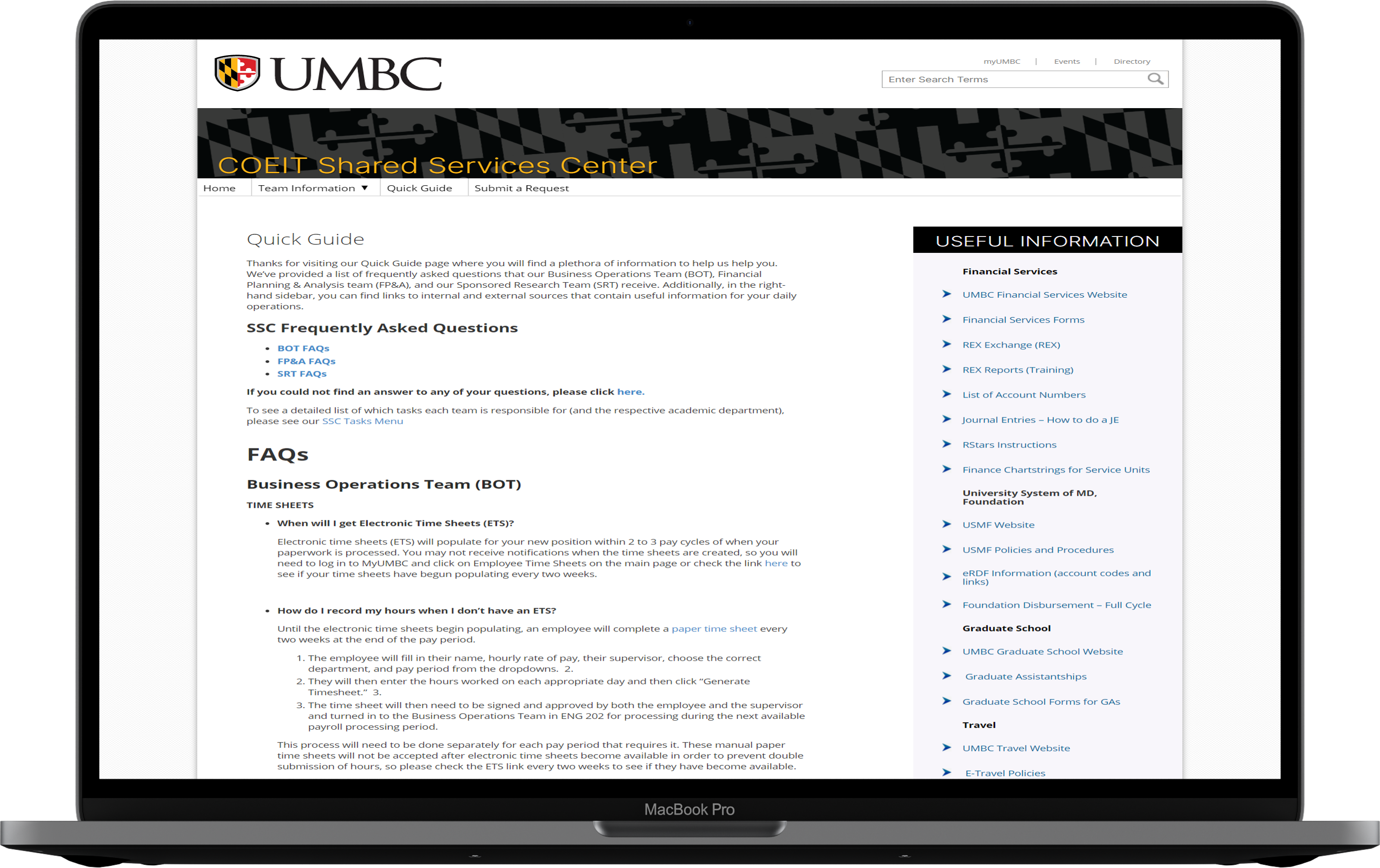
A SSC subpage.
#1: VISIBILITY OF SYSTEM STATUS
Outdated Images may throw the user off guard and may be one of the main issues that increases the bounce rates.
#2: MATCH BETWEEN SYSTEM AND THE REAL WORLD
The content within the website may be known to the people working in the Shared Services Center, however it may be difficult for a general audience to comprehend.
#8: AESTHETIC AND MINIMALIST DESIGN
Images do not link to the information presented in the website.some of the information on the website is repetitive and is a waste of time for the users. Cluttering of content does not help.
NET PROMOTER SCORE
I reached out to facebook groups, Whatsapp chats, and other forums with college students to know if they would recommend this website or not. The NPS score is a good indicator to tell me if the website needs improvements or not. I sent out the survey twice in a span of 6 months.
56
Survey Respondents
Promoters - 28
Passives - 11
Detractors - 17
Total = 56
NPS SCORE = 30.3
I like this graphic (Referring to the graphic on the homepage). Always catches my attention, graphics. But I really do not know what/why these images on the homepage even exist. - Participant
Insights
From the quickfire research conducted, coupled with NPS scores and quantitative data, I gathered the following insights.
Content Redundancy Content is repetitive in a lot of places, making the user shy away from the website.
Context Content is littered with jargons and can be simplified.
Links: Images do not have links and some of the text are colored like links but do not function as links.
Carousel: Carousel is pretty but is unwanted by the users. Feels like it is "just there".
HomePage: Home page appears bland to make users stay on the page.
Content: Content can be made concise to accomodate all the information.
Color: An overwhelming opinion is about changing the color to the either the university colors or an alterative color scheme.
Abbreviations: All abbreviations to be expanded on the website for clarity.
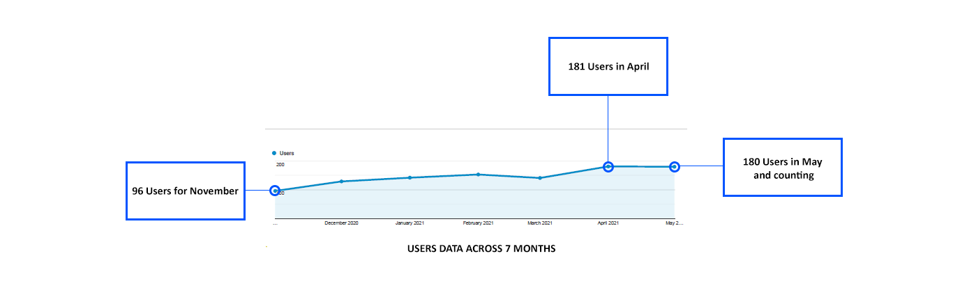
Number of users: Comparitively low for the month (< 100)
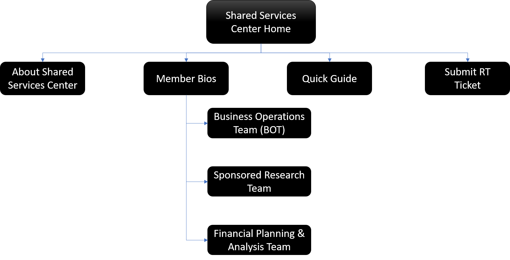
New Information Architecture
Impact
Through observations and incorporating quantitative data, the team managed to improve the NPS from 30 - 50.
Increase the number of users over a period of 6 months to an all time high of 181 users for a single month.
The page views have been consistent and the bounce rates came to stand at an all time low of 27%.
Due to the changes implemeted post user research, the numbers show that the average number of page views was higher than what was before the redesign, with an all time high of 1079 page views after the redesign.
Next Steps
As a team, we would be monitoring the data with respect to bounce rates, click rates over the course of the next three months. The team will perform various tests on the new website and compare the metrics with the older version to check how the website is doing. Post three months, the team would send out another survey with respect to the NPS scored that now stands at 50.
Takeaways
This was the first job that introduced me to statistical research. I learned that numbers are essential when it comes to any project that deals with completion rates, and bounce rates. A steep learning curve nonetheless, I feel that given the start, I am now empowered with another tool in my research arsenal. This project has taught me to integrate qualitative and quantitative in a short period of time. Something that I look forward to doing in my upcoming works of UX.