B-AID : An assistive mobile application for individuals who are blind
What's this about?
According to the WHO website, globally, it is estimated that at least 2.2 billion people have a vision impairment or blindness, of whom at least 1 billion have a vision impairment that could have been prevented or issues that are unaddressed. These technologies include mobile applications, smart walking sticks, voice assistants, and so on., This is project driven by my motivation to help individuals who are in need of assistance.
My Role
I worked on this project alone, merging both my UX Research and UX Design skills. I designed a mobile application to assist individuals who are blind in their navigation.
Troublesome Information
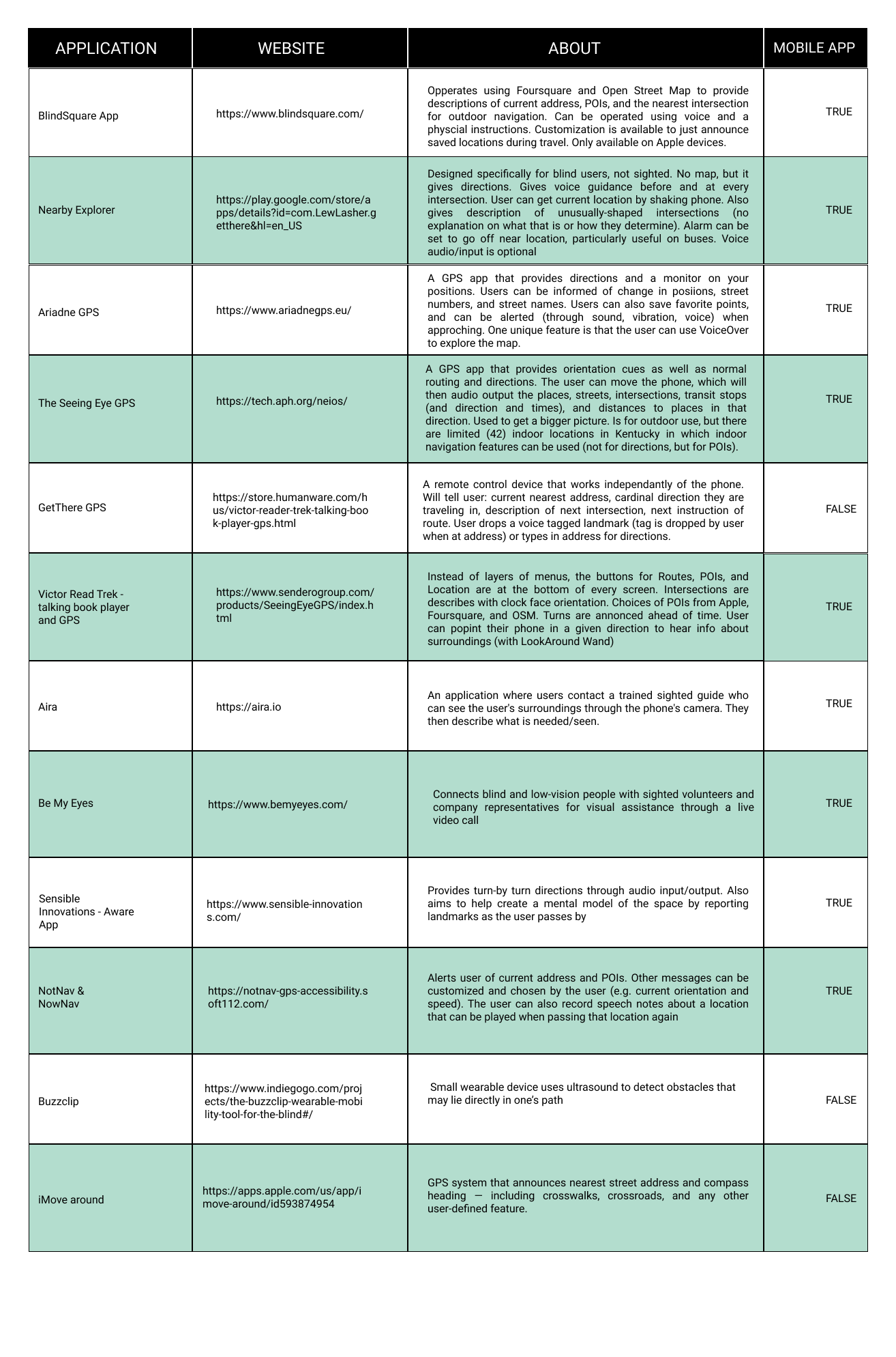
- Although there are numerous mobile applications to aid individuals who are blind, there is no single application in the market that encapsulates all the functions.
- Either the applications are unheard of or work on a payment model.
- Application functionalities are spread across specialized assistance through personnel, point of interest information, environmental awareness, and so on.,
- Ease of access among prospective users.
Outcome
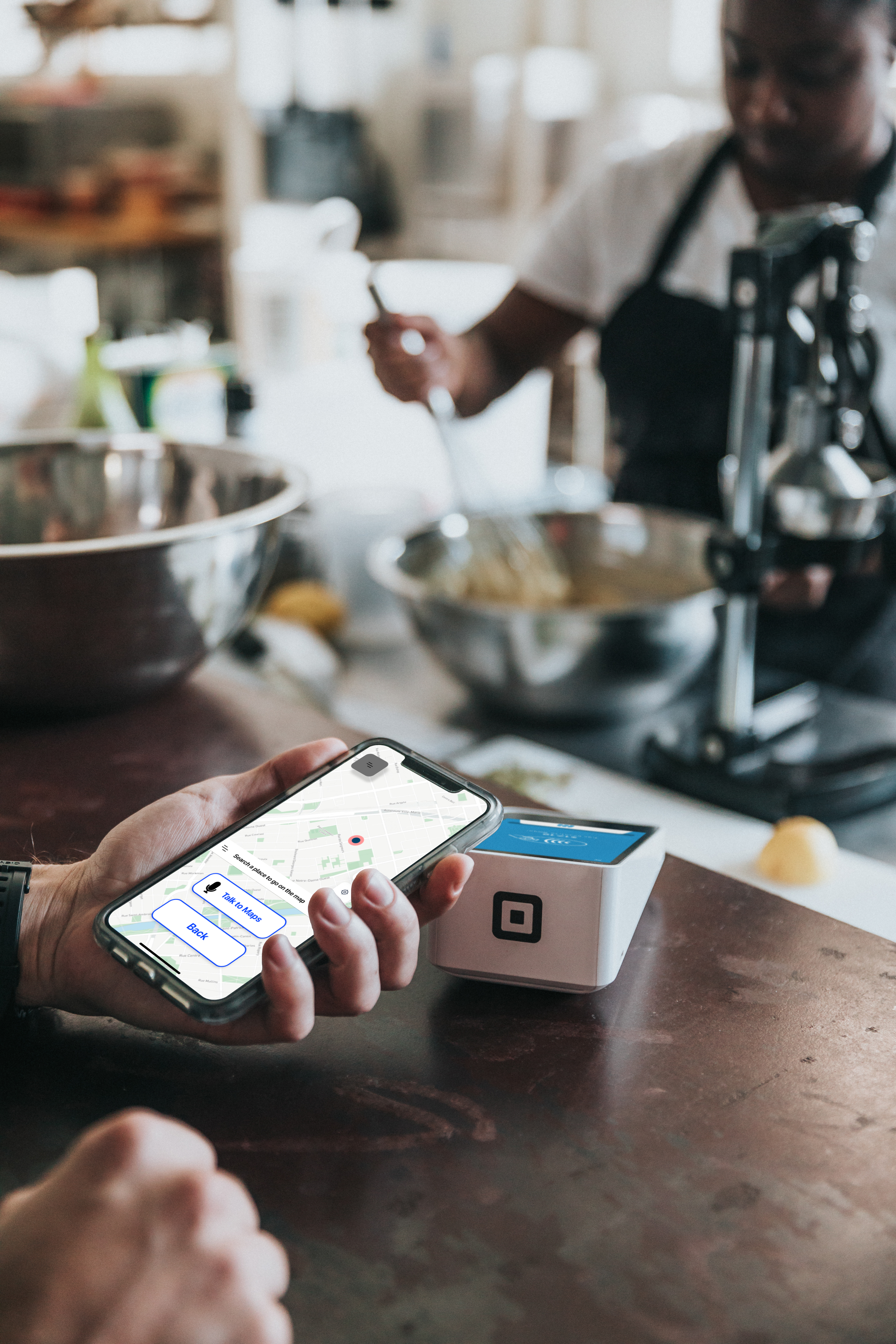
A mobile application that assists individuals who are blind in their navigation with functions like intra-app bluetooth connectivity, people voice assistance help, a LYFT like model to connect sighted volunteers for face to face help and a map that reads voice input.
Goals of the project
Currently the functionalities are spread out across applications which leads me to wonder, can I make an application prototype that puts all the navigation functionalities in one application?
Challenges in making the application
- First time experience making a voice application increase the time taken to complete.
- Field Studies were difficult to execute as many people travel without phones.
- Limited number of people available to try it.
- Language translation to English was time consuming as I conducted the interviews in Bangalore, India. The participants primarily spoke Kannada (The regional language).
It’s very difficult when it is heavily raining [in the monsoon season] as we have to hold an umbrella in one hand and cane in the [other] hand so navigating becomes hard for us.
The lead up to the designs
I used the data collected from the interviews conducted in conjunction with other user research like market analysis to know what the applications do, followed by field studies where I wanted to observe the participants in their natural element.
I created Empathy maps and Personas to understand my users pain points with respect to a navigational application and it's constraints. For ideation, I created a mini Affinity Map and chalked out story boards to give me a view of how things may work in a real world scenario. All these techniques made come up with an application that may encapsulates things that users would like to see in a navigational application. For this project, I decided to employ the standard design thinking process.
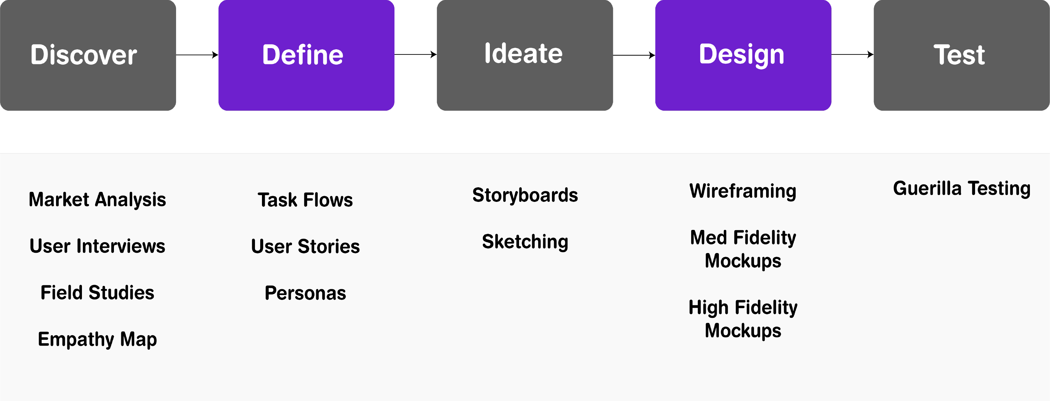
Discovery
I started out with generative research to get the pain-points and preferences of individuals using navigation applications. Conducting user research gave me an idea on how the design should be to yield maximum results.
To get a feel of what they feel like when they wear devices while moving from one place to another, I decided explore some of the mobile applications and other devices thoroughly.
I conducted interviews with 14 participants to understand their attitudes and nature while they navigate from one place to another. I got information related to a variety of environmental factors, in conjunction with using technology for navigation. I recruited participants by reaching out to a charity run blind school.
Participants Interviewed Demographic: Individuals who are blind. Age - 18-27 Gender: Any Ethnicity: Asian (Indian) Device Mobile (Android and IOS), Laptop, Desktops, IPad and other android tablets.
I travelled to blind schools to observe the individuals in a natural space, taking down notes, combining the information obtained with the interviews to draw insights. It enabled me to understand the intricacies and complexities of daily life. Following up with the participants in their natural element made me uncover information that I was not previously aware of.
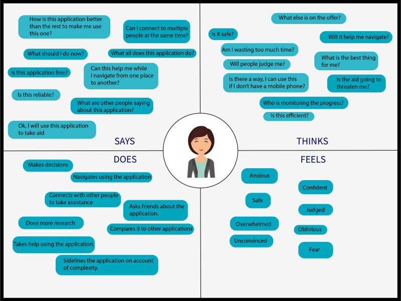
I came up with an empathy map to understand and prioritize the user's needs. I put this step as a forward to the user interviews. By taking one of the participants from the interview as a stand point, the empathy map was created. MARKET ANALYSIS
USER INTERVIEWS
#1. Information Beforehand.
#2. Planned Routes vs Unplanned Routes
#3. Information on Static and Dynamic Obstacles
#4. Environmental Noise.
#5. Some are new to technology
#6. Human Assistance
FIELD STUDIES
Insights
EMPATHY MAP
Define
Once the initial discovery phase was completed, I moved on to the define phase where my main focus was on identifying the user base and understanding the target audience through Personas and understanding them, to understand how the information would read to the person operating the device.
USER BASE
From the discovery stage, I came to a conclusion about the user base. These could be any person from the age of 15 and above, who uses a mobile phone for communication and has basic knowledge of maps.
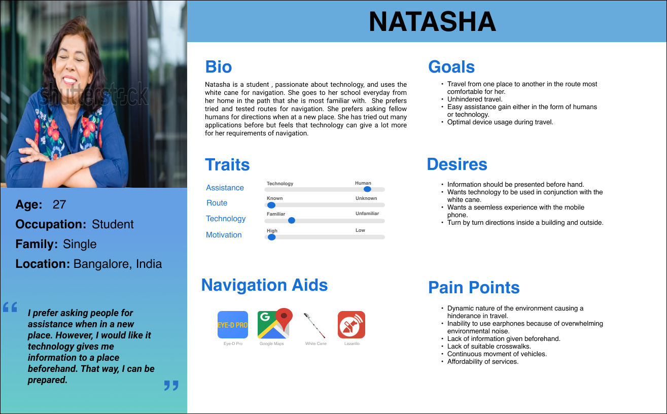
PERSONAS
Among the other things, they want to see applications that give them the presence of sidewalks, the positioning of intersections, an emergency assistance button, and a scanner of handwritten data. Additionally, several application-specific pointers were noted down and eventually referenced to a User Persona to get an idea of how the application will be shaped in the future. To better understand what the audience under consideration need and what the application might serve.
Ideate
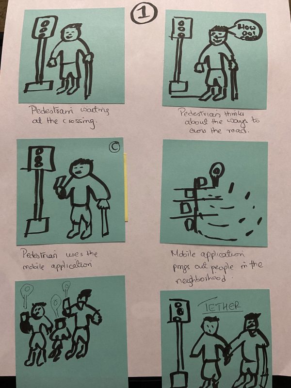
STORYBOARDS
I created early research storyboards to envision the finished application in terms of a real world setting. Turns out, the storyboards were very short, sequence-orientated, and fit the overall narrative well. I envisioned the finished research project - how the mobile application would function in a real life scenario.
Storyboards changed my perception of the functionalities that can be implemented in my project. I realized that my application cannot have all the functionalities that I desire because of constraints indicated by the storyboards. The storyboards helped me synthesize the content and match my thinking with the constraints.
AFFINITY MAP
Having obtained the data and identified the target audience, I created an affinity map to draw themes and prioritize them.
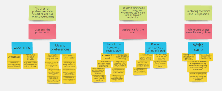
Insights
From the information obtained from the discovery, ideation and the define phases, I populated the following insights.
- Functions: Participants look for functions to be ‘visible’ – easily identifiable.
- Specific Information: Look out for information like Bus Route Information, Bus Stop names, nearby accessible stops, etc.,
- Information Presentation: Participants want information to be presented to them directly via the application or require fellow human to tell them navigational directions.
- Click Rate: Preference with minimum clicks and maximum utility for each section of the application.
- Information Overload: Participants mentioned that they do not want information overload when it comes to the navigation application.
- Technology vs Human-assistance: Participants want timely assistance when it comes to navigation and other activities that tend to make them take assistance.
❗ Importance of Progressive Disclosure
I am extremely mindful to employ progressive disclosure. Given that we are dealing with individuals who are blind, we really cannot push too much information on a single screen. The content has to be relatively easy to identify and understand. Progressive Disclosure would allow me to push all the information that was not necessary to screens at the back that would only appear when needed. (Based on the functionalities presented to the user.)
Prototype
Starting with the Pen and Paper Sketches for low fidelity, Balsamiq Mockups for medium fidelity, and Adobe XD for high fidelity mockups, I went in stages.
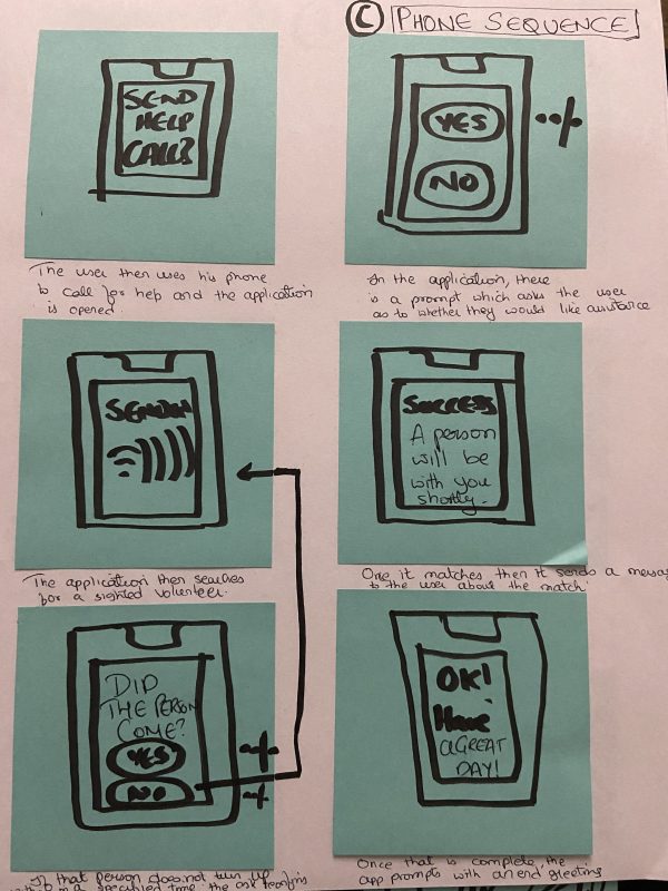
Low Fidelity Mockups
I love to put my thoughts on paper so I decided to go ahead with the pen-paper route. Anything that comes to my mind has to hit the white sheet first.
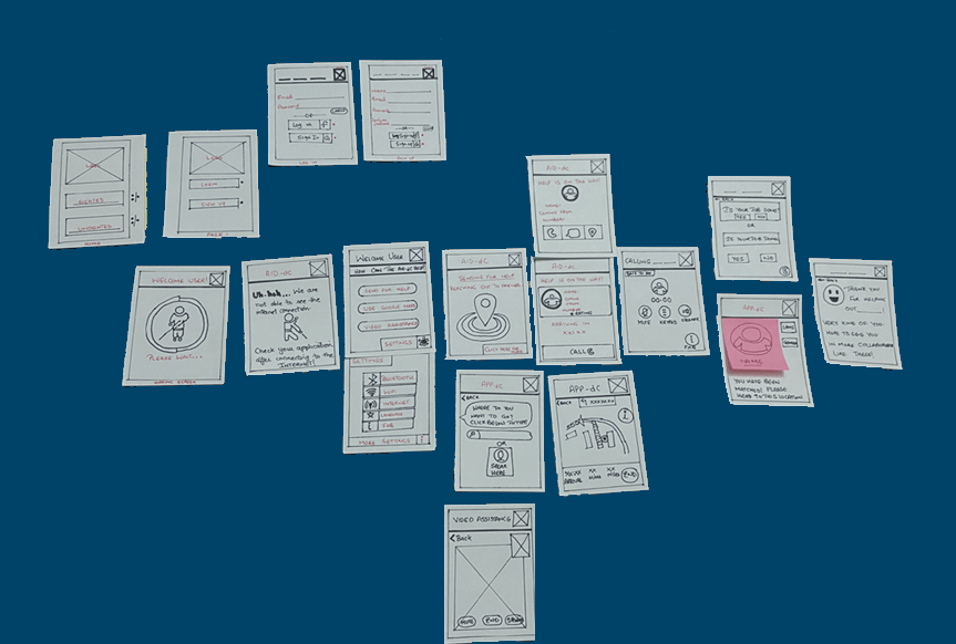
Medium Fidelity Mockups
I used Balsamiq Mockups to generate the wireframes of the skeletal structure of the application. Balsamiq Mockups is a great tool with a low learnability curve and relative ease of use.
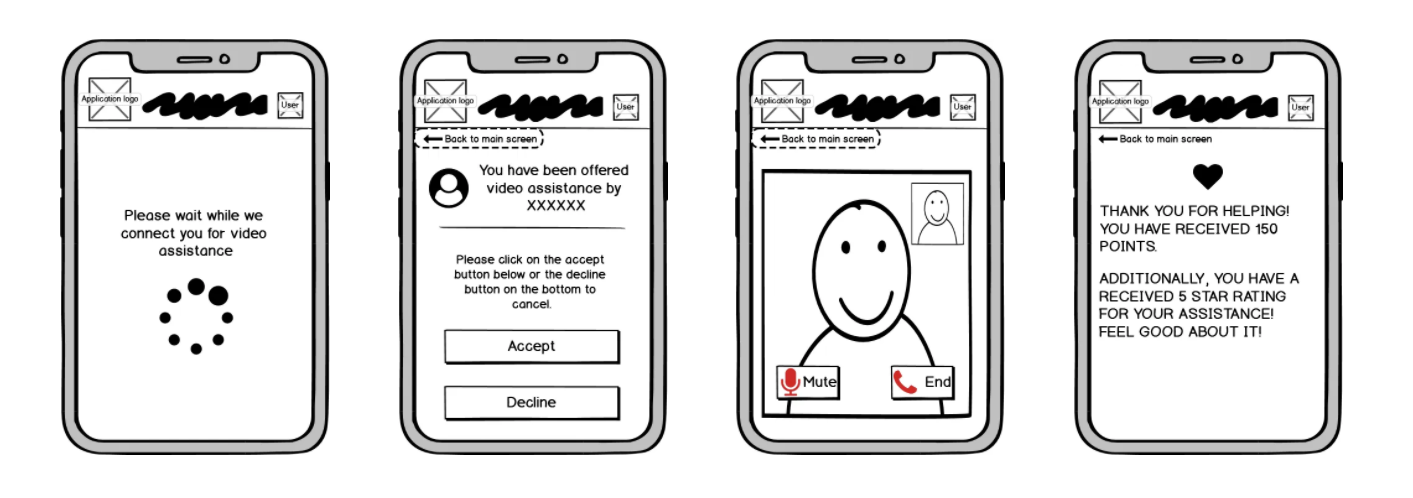
Main Screen
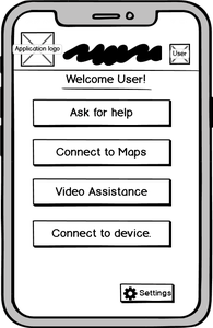
This is the main page and is a key component in the application. It has 3 pivotal functions
Ask for Assistance , Connect to Maps , Video Assistance
Function Screens #1
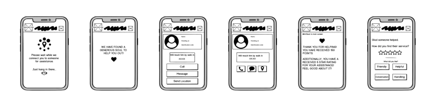
Function Screen #2
Prototype
Adobe XD was the tool used and I also used voice feature given by the tool to do the same.
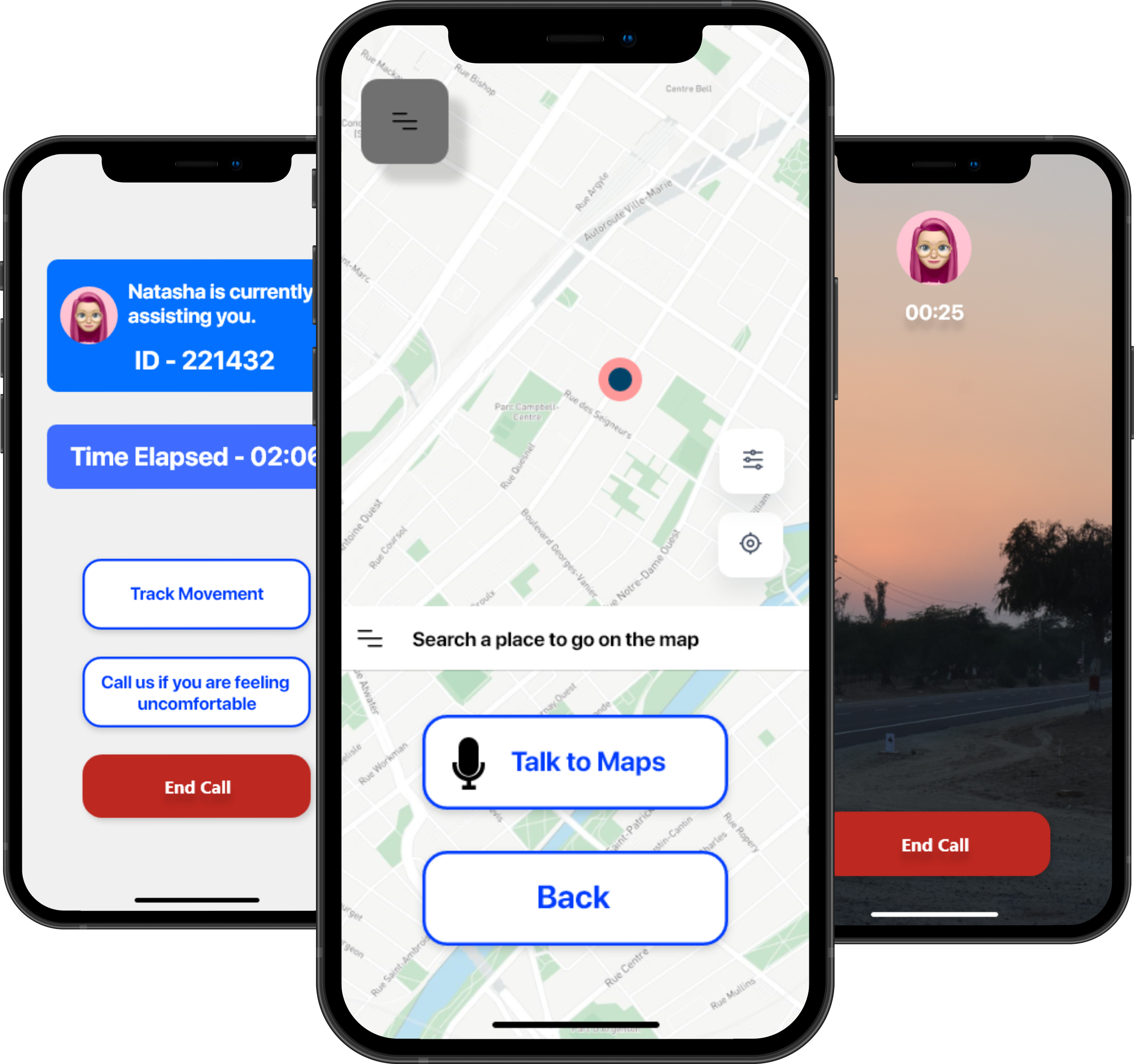 To take a look at the prototype, click Here
I want some information from the maps once I talk to it about a location. I know it is possible, but I have never tried it before.
Next Steps
What next? I am more than thrilled that the project came into being and I was able to put my skill to the test. The next step would be to test it out with users to see how much the application concept is appreciated in terms of feasibility and make ammeds respectively. Once the variations are done, I would like to build an application that mirrors the functionalities of the same.
Takeaways
This was a project filled with learning. Interviewing a niche audience is always a challenge by itself. The one thing I learned more than anything while doing this project is to have a certain level of patience because it takes a lot of time and effort for an idea that relates to such an audience to come to life. I find field studies quite challenging and I cannot wait to observe more users in their element in the future. The potential is there, the people want technology to lead them to better futures. What better than UX to mop up an idea?